An expert guide combining design theory, a structured method, and concrete examples to create a truly professional mood board.
Key points of the guide
Personalizing a mood board stimulates creativity and strengthens the project's visual strategy.
A clear structure improves team alignment and reduces approval round trips.
Visual choices must follow recognized design principles: contrast, proximity, repetition, hierarchy, balance.
A professional mood board combines images, colors, typographies, textures, annotations, and context.
Tools like Canva, Pinterest, or Milanote become much more powerful when combined with expert methods (palette extraction, templates, annotations, workflows).
Why create a personalized mood board?
Stimulate creativity (with a clear method)
When you personalize your mood board, you open the door to new ideas. You can draw inspiration from artists like Laure Prouvost to integrate artistic elements into your creations. Some creators enjoy cutting and pasting images by hand. This simple gesture makes the process more lively and allows you to better feel your ideas.
Creative studios often work in three stages:
Divergent phase: massive collection of ideas, images, textures, personal photos.
Convergent phase: sorting and selection based on your project and target audience.
Orchestration: narrative layout to tell a coherent visual story.
Pro tip: Reorganize your mood board 3 to 5 times. Moving elements forces you to explore new combinations and increases your creative engagement.
Define a clear direction for your project.
Gather ideas and give them meaning.
Guide your graphic choices to create a consistent visual identity.
Materialize an atmosphere that reflects your personality or that of your company.
Clarify your vision and align your team
A personalized mood board helps you gain clarity on your desires and objectives. It is often the first validation milestone in a professional project. You can inspire the people you work with and align the entire team's ideas. This support lays the foundation for your project's visual universe.
Inspire project participants.
Align the team's or client's ideas.
Lay the foundation for the project's visual universe.
When you use a custom design, you adapt every detail to your vision. You facilitate communication, limit misunderstandings, and gain efficiency from the very first stages of the project.
Assert your style and visual identity
Personalizing your mood board allows you to assert your style. You showcase what sets you apart and create a strong identity. For example, some mood board templates on Instagram are easy to modify. You can adapt them to your brand or personal projects.
Customizable and aesthetic mood boards.
Easy to modify to adapt to your universe.
Perfect for expressing your creativity and unique style.
Mood board and custom design: a professional method
 Image Source: pexels
Step 1 – Define the objective: the D.O.C.E method
Before starting your mood board, you need to know why you are creating it. A clear objective guides you at every step. Here is a simple method used by creative studios: the D.O.C.E. framework.
D – Direction: what emotion, atmosphere, or story do you want to convey?
O – Objective: what should this mood board achieve (branding, interior design, clothing collection, photo shoot…)?
C – Constraints: budget, deadlines, target audience, media (web, print, social media…), technical requirements.
E – Visual requirements: photo style, types of textures, types of angles, authorized or prohibited typographies.
Here are some criteria that help you effectively define the objective of your mood board:
Creative flexibility: you explore different styles and aesthetics without limiting yourself.
Visual richness: you create a source of inspiration with varied images.
Adaptability: you use the mood board for unique portraits or projects where each image has a strong identity.
Tip: Write your objective at the top or in a corner of your mood board. Also add a small "To avoid" section (forbidden colors, styles, or atmospheres) to limit misunderstandings.
Step 2 – Choose a consistent visual style
The visual style sets the tone for your mood board. It influences how you present your ideas and how others perceive your project. You can choose a style based on your objective, your personality, or current trends.
Here are some popular visual styles for personalized mood boards:
Maximalism: vibrant compositions, bold colors, attention-grabbing overlays.
Scrapbooking effect: collages, photo overlays, handwritten typographies for authenticity and creativity.
Handcrafted illustrations: hand-drawn visuals, irregular lines, natural textures for a human touch.
Each style brings a different atmosphere to your custom design. You can test several styles before choosing the one that best suits your project. Don't hesitate to mix trends or invent your own style to make your mood board unique.
Tip: Observe mood boards shared on social media or in designers' portfolios. You'll find inspiration and discover new ways to express your ideas.
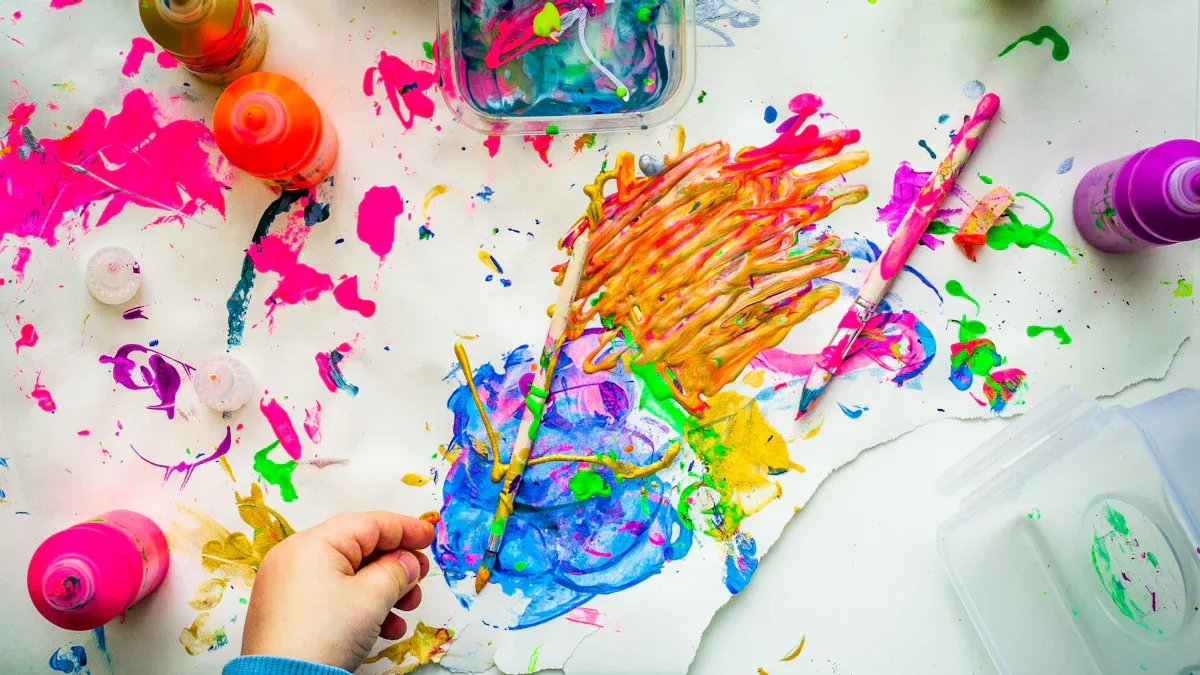
Selection of visual elements
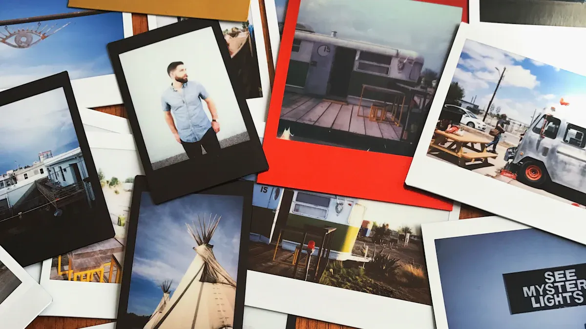 Image Source: pexels
Images and colors: applying color theory
You need to choose images and colors that tell a story. Experts recommend taking photos of what inspires you in daily life. You can photograph flowers, buildings, or objects that catch your eye. You enrich your mood board by capturing images from your environment.
Creative trends evolve rapidly. You benefit from conducting preliminary research to gather current ideas. You can also draw inspiration from nature for colors and textures. Plants, textiles, and materials express different feelings. You should not censor yourself. Let your imagination run wild to create a visual universe that reflects you.
Take photos of what inspires you, such as flowers or buildings.
Research creative trends before starting.
Let your imagination speak and don't limit yourself.
Capture images from your daily environment.
Use varied objects like plants, textiles, and materials to express emotions.
60–30–10 Rule for a harmonious palette
60%: dominant color, structuring the visual universe.
30%: secondary color, enriching the composition.
10%: accent color, used to draw the eye to key elements.
Color psychology (examples)
Warm colors: energy, friendliness, spontaneity.
Cool colors: seriousness, trust, professionalism.
Natural tones: authenticity, calmness, closeness.
Tip: Create a color palette from your favorite photos. You can use online tools to extract main hues and harmonize your mood board.
Typographies and textures
The choice of typographies influences the perception of your project. Each typeface conveys a different mood. A handwritten font gives a warm and personal impression. A sans-serif font brings modernity and clarity. The shapes and alignment of typography alter visual interpretation.
Textures add a tactile dimension to your mood board. They reinforce the overall atmosphere and make the visual more lively. You can integrate natural textures, such as wood or fabric, to create an authentic atmosphere.
Typefaces have different meanings depending on their style.
A handwritten font conveys a different mood than a sans-serif font.
The shapes and alignment of typography influence visual interpretation.
Textures add a tactile dimension that reinforces the mood board's atmosphere.
Each figurative or abstract form conveys a specific message.
Shapes like circles, rectangles, or geometric patterns have varied meanings.
The suitability of shapes to the industry is essential for effective communication.
Advice: Limit yourself to a maximum of two typographic families for good readability, and test several textures before finalizing your mood board.
Tools for a personalized mood board
Online platforms
You can use several online platforms to create a personalized mood board. Each tool offers different functions to meet your needs. Canva remains very popular due to its intuitive interface. Pinterest helps you find inspiration. Milanote gives you a flexible space to organize your notes and images. Adobe Express, Niice, or Mural are also very useful depending on whether you work alone or in a team.
Canva: ideal for a quick and polished result.
Pinterest: perfect for visual inspiration.
Milanote: flexible canvas for structuring your ideas.
Adobe Express: access to numerous graphic elements.
Niice: designed for real-time collaboration.
Mural: collaborative tool for brainstorming.
You can also explore Notion, Firefly Boards, BoardPro, Venngage, PowerPoint, or Word.
Mobile applications
Do you prefer to work on your phone or tablet? Several mobile applications allow you to create and modify your mood board wherever you are. Canva, Pinterest, Adobe Express, or Milanote have applications that facilitate quick mood board creation.
To choose the best platform or application, you need to consider several criteria:
Collaboration capability
Adaptability to different digital media
Organization and visual consistency
Structuring the space
You need to organize the space of your mood board to make every idea visible and understandable. Experts recommend grouping elements by categories. You can place color images together to create a harmonious palette, group materials, furniture, lighting, accessories…
Color palette: group swatches and material images in the chosen shades.
Materials and textures: place fabric, wood, or metal samples in a specific area.
Furniture: add images of furniture that define the style.
Lighting: insert photos of lamps and pendants in a clear section.
Accessories and decoration: arrange examples of rugs, cushions, and decorative objects together.
Art and wall elements: present ideas for paintings and coverings in a dedicated section.
Atmosphere images: select photos that evoke the general feeling sought.
Tip: Use white space to separate groups of elements. You facilitate readability and avoid visual overload.
Harmonizing elements
Visual harmony gives strength to your mood board. You must choose elements that complement each other and create consistency. Colors, shapes, and textures must harmonize to form a pleasant whole. Avoid an overabundance of images and styles.
Consistency of elements: select images and objects that share a mood or style.
Less is more: limit the number of elements to maintain a readable structure.
Clear structure: organize each section so the eye easily follows the main thread.
Advice: Step back and observe your mood board as a whole. You will quickly spot elements that don't fit and adjust to enhance harmony.
Personalize with custom design
Add annotations
You can make your mood board more lively by adding annotations. Design professionals recommend using notes to explain your choices and clarify your ideas. You facilitate communication with your team or clients.
Tip: Use virtual sticky notes or text boxes to write your remarks. You can indicate why you chose a color or how a texture influences the mood.
Annotations improve project understanding.
They help share your vision with others.
You can explain the role of each element in your custom design.
Integrate illustrations
You can enrich your mood board by adding illustrations. Drawings, sketches, or pictograms add a personal touch to your project. You use illustrations to show ideas that cannot be found in photos.
Advice: Try to create simple illustrations with tools like Canva or Adobe Express. You can also scan hand-drawn sketches to integrate them into your mood board.
Bring original textures
You can add depth to your mood board by incorporating original textures. Designers enjoy grouping images of colors and textures to create a thoughtful atmosphere. You can identify recurring patterns and choose materials that match your project.
Tip: Gather images of furniture, fabrics, and natural materials. You can create a physical board with samples or a digital mood board for a coherent vision.
Group images of colors and textures to enrich your project.
Identify patterns that frequently appear in your visual universe.
Integrate textures and materials to create an emotional connection.
Consider light and color to give character to your custom design.
Tips for an effective mood board
Harmonious palette
You want your mood board to be eye-catching and pleasant to look at. Experts recommend choosing a well-thought-out color palette.
Select three main colors:
Use a dominant color for 60% of your visual universe.
Add a secondary color for 30% of your creations.
Finish with an accent color for 10% of the elements.
Consider the meaning of colors:
Warm colors bring energy and positivity.
Cool colors give an impression of seriousness and professionalism.
Play with transparency:
Adjust opacity to create nuances and enrich your palette.
Tip: Create a palette on paper or with an online tool. You'll quickly visualize the harmony between your colors.
Clear structure
A clear structure makes your mood board easy to understand. You guide the eye and tell a visual story.
Organization around a central image attracts attention.
A well-defined visual path helps convey your message.
An engaging arrangement of elements facilitates visual storytelling.
Advice: Place important elements in the center or along a guideline (Z-shape or grid). This creates an accessible and captivating presentation.
Adapt to your project
You should always adapt your mood board to the specific needs of your project. User feedback and behavior analysis help you optimize your design.
Observe user habits to adjust the presentation.
Analyze feedback to improve interface and structuring.
Strive to make your mood board intuitive and pleasant to use.
Key takeaway: An effective mood board meets project expectations and facilitates understanding for everyone.
Inspirations and examples
Successful mood boards
You can draw inspiration from many mood boards created in various fields. Here are some examples of projects where the mood board plays a key role:
Interior design: you visualize the atmosphere of a room before starting work.
Fashion: you create a clothing collection by gathering fabrics, patterns, and colors.
Branding: you develop a brand's visual identity with logos, typographies, and palettes.
Photography: you prepare a photo shoot by setting the tone, accessories, and backdrops.
Here is an overview of models popular with users:
Tool | Features | Cost |
|---|---|---|
Milanote | Flexible canvases for organizing ideas and images. | Free version, paid at $150/year |
Platform for inspiration and image sharing. | Free, paid options available | |
Physical Mood boards | Tangible collages, direct manipulation of elements. | Variable cost depending on materials |
Tip: Explore the templates offered by these tools to find the one that matches your project.
Inspirations by sector
You can seek inspiration in several professional sectors. Each domain uses the mood board for specific needs:
Interior design: store layouts, choice of colors and materials.
Fashion: collection creation, selection of fabrics and patterns.
Branding: logo redesign, definition of a brand's graphic universe.
Photography: shooting preparation, choice of atmospheres and accessories.
Behance allows you to discover creative projects from around the world. You can observe mood boards for website design or UX design there.
Tip: Don't hesitate to share your mood board on social media. This facilitates the sharing of your creative concepts and allows you to get feedback to improve your work.
Creating a personalized mood board allows you to communicate your ideas and bring your project to life. Analyze the visual elements, ask yourself the right questions about competitors, then propose a mood board adapted to your expectations.
Use mind mapping to organize your ideas.
Practice brainstorming to stimulate your creativity.
Create an environment conducive to experimentation.
Remember, your mood board should always reflect your identity and objectives.
FAQ about mood boards
How to start a mood board if I have no ideas?
You can observe your environment. Take photos of what inspires you. Explore Pinterest or Behance. Note your emotions when looking at images and then assemble your findings on a simple medium (Canva, Milanote, A3 sheet…).
What free tools can I use to create a mood board?
Canva (free version)
Pinterest
Milanote (free version)
Google Slides or PowerPoint
Should I only use professional images?
No, you can use your own photos, drawings, or royalty-free images. Mix different types of visuals to express your personality and style.
How can I make my mood board consistent?
Create a color palette, limit yourself to one or two typeface families, group elements by theme, and check the overall harmony by stepping back.
Can I share my mood board with others?
Yes, you can share your mood board online, via a link or PDF. Asking for feedback is an excellent way to improve your project and refine your artistic direction.