The fashion industry is constantly evolving, but certain hues manage to capture our collective imagination and establish themselves as timeless staples. One such shade making waves this season is Butter Yellow. Soft, creamy, and undeniably uplifting, this subtle pastel is redefining summer aesthetics, particularly in the resort wear and swimwear sectors. Unlike stark whites or overly vibrant neons, butter yellow offers a sophisticated warmth that feels both luxurious and approachable.
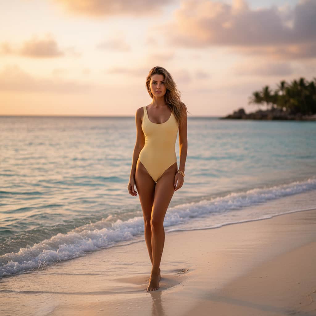
For fashion brands, understanding how to leverage this trending color is crucial for product development and marketing. In this comprehensive guide, we will explore a real-life color matching test for different skin tones and introduce exclusive beach photography filter concepts to help your brand perfectly capture the essence of butter yellow.
Butter Yellow Skin Tone Matching: A Real-Life Testing Guide
One of the most common concerns when introducing a new color palette is its versatility across diverse consumer demographics. Butter yellow is uniquely positioned as a universally flattering shade, but its interaction with various undertones can create distinctly different visual impacts. We conducted a real-life testing guide to evaluate how butter yellow complements different skin tones, providing valuable insights for your next swimwear collection.
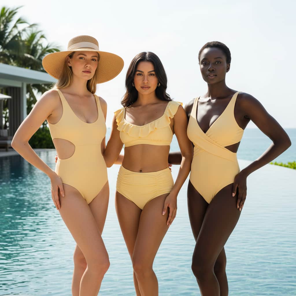
1. Fair Skin Tones with Cool Undertones
For individuals with fair skin and pink or bluish undertones, pastel yellows can sometimes be intimidating. However, butter yellow contains just enough warmth to counteract redness without washing out the complexion.
- The Verdict: Highly flattering. The creamy nature of the color provides a gentle contrast.
- Styling Tip: Incorporate textured fabrics like ribbed materials or terry cloth in your swimwear designs to add depth and prevent the color from looking flat against pale skin.
2. Medium and Olive Skin Tones
Olive skin tones possess natural green and yellow undertones, which can either clash with or beautifully harmonize with yellow garments. Butter yellow, being a muted and soft variation, leans towards the latter.
- The Verdict: A perfect match. The buttery hue enhances the natural golden glow of medium and olive skin, creating a seamless, sun-kissed appearance.
- Styling Tip: Utilize sleek, matte finishes and minimalist silhouettes. The color speaks for itself and accentuates the natural tan of the wearer.
3. Deep and Dark Skin Tones
Deep skin tones provide the most striking canvas for pastel colors. The high contrast between rich, dark skin and the soft, luminous quality of butter yellow creates an incredibly vibrant and luxurious aesthetic.
- The Verdict: Absolutely stunning. The color pops vibrantly, highlighting the richness of deep skin tones and creating an eye-catching, editorial look.
- Styling Tip: Experiment with glossy finishes or subtle metallic hardware in your swimwear pieces to elevate the contrast and add a touch of glamour.
Capturing the Vibe: Butter Yellow Beach Photography Filters
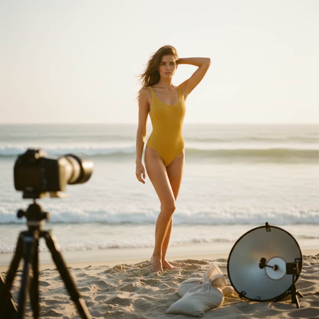
In the digital age, how a color translates on screen is just as important as how it looks in person. To help swimwear brands market their butter yellow collections effectively, we have conceptualized two distinct beach photography filter styles. These editing directions are designed to enhance the buttery tones and create a cohesive, aspirational visual narrative for your social media and e-commerce platforms.
The "Golden Hour Glow" Preset
This editing style is designed to mimic the warm, diffused light of late afternoon. It emphasizes the yellow hues in the image, making the butter yellow swimwear appear richer and more saturated.
- Color Grading: Increase warmth (temperature) and slightly boost the magenta tint to soften harsh shadows. Enhance the luminance of yellow and orange channels.
- Ideal Scenario: Sunset beach shoots, lounging by the pool in the late afternoon. This filter creates a romantic, luxurious, and highly engaging visual experience.
The "Soft Coastal" Preset
For a more modern, editorial look, the "Soft Coastal" approach reduces overall contrast and introduces a slightly cooler, desaturated background, allowing the butter yellow garment to remain the focal point.
- Color Grading: Lower the highlights and lift the shadows for a matte finish. Desaturate blues and greens slightly to create a muted background, while keeping the yellow channel clean and bright.
- Ideal Scenario: Mid-day beach photography, rocky coastal backdrops, or minimalist studio shoots. This filter communicates a sense of calm, premium quality, and contemporary elegance.
Elevating Your Swimwear Brand with Butter Yellow
Integrating butter yellow into your product line is more than just following a trend; it is about offering your customers a sophisticated, versatile, and emotionally resonant option. Whether through carefully considered fabric choices that flatter every skin tone or through strategic visual marketing that captures the perfect summer mood, this color presents a significant opportunity for brand growth.
Understanding the nuances of color theory, fabric sourcing, and production quality is essential for bringing these concepts to life. This is where partnering with an experienced manufacturing expert becomes invaluable.
Bring Your Butter Yellow Collection to Life
Are you ready to incorporate the season's most coveted color into your next swimwear line? As a premier B2B swimwear manufacturer, we specialize in transforming your creative visions into high-quality, market-ready products. We offer comprehensive Swimwear Customization, full-scale OEM/ODM Services, and dedicated Brand Cooperation tailored to your specific business needs. From precise color matching and premium fabric sourcing to flawless production and quality control, our expert team is here to support your brand's success.
Contact us today to discuss your next project, request fabric swatches, and discover how our manufacturing solutions can elevate your swimwear brand.
Frequently Asked Questions (FAQ)
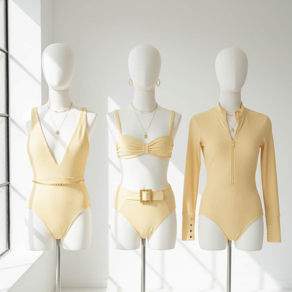
1. Is butter yellow suitable for all types of swimwear fabrics? Yes, butter yellow is highly versatile. It looks exceptionally luxurious on textured fabrics like pique, ribbed nylon, and terry cloth, which add depth to the soft color. It also translates beautifully onto smooth, matte spandex for a sleek, modern aesthetic.
2. How does butter yellow perform in terms of opacity when wet? Opacity is a critical factor in swimwear. High-quality butter yellow swimwear requires premium, dense lining to ensure it remains completely opaque when wet. When working with a reliable OEM/ODM partner, specific lining techniques and fabric weights are selected to guarantee full coverage and consumer confidence.
3. Can butter yellow be effectively combined with other colors or prints? Absolutely. Butter yellow serves as an excellent base for subtle floral prints or geometric patterns. For color blocking, it pairs beautifully with soft sage greens, dusty blues, or even rich espresso browns for a sophisticated, retro-inspired look.
4. What are the minimum order quantities (MOQ) for customizing a butter yellow swimwear collection? MOQs typically vary depending on the complexity of the design and the specific fabrics required. As a dedicated B2B manufacturing partner, we offer flexible OEM/ODM solutions designed to accommodate both emerging independent labels and established brands scaling their production.
5. How can I ensure the butter yellow color remains consistent across different production batches? Color consistency is achieved through rigorous lab dipping and quality control processes. A professional manufacturing partner will utilize standardized Pantone matching and conduct thorough colorfastness testing to ensure that the butter yellow hue remains perfectly consistent and resistant to fading from sun, chlorine, and saltwater.